Case study · Brand foundation · €1,500 · three to four weeks
WOBBLE
A sparkling functional fruit drink with a silly name and five colours that all shout — and the one rule that stops it becoming a bouncy castle.
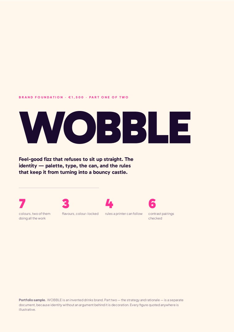
Case study · Brand foundation · €1,500 · three to four weeks
A sparkling functional fruit drink with a silly name and five colours that all shout — and the one rule that stops it becoming a bouncy castle.
A drink brand at the point most of them get stuck: the product is decided, the flavours are decided, and nothing else is. There is no shortage of ideas — there is a shortage of anyone willing to say this one, and here's why.
The functional-drinks aisle is where good design goes to look like everything else. Pastel gradients, a serif wordmark, a line about wellness. It photographs beautifully and it is invisible in a chiller at arm's length, which is the only place it actually competes.
One direction, taken all the way up: nothing sits still. Everything drips, bounces, tilts and pours. WOBBLE looks like a drink caught mid-splash — organic, off-kilter, soaked in colour. If it looks like it was made in a corporate template with a ruler, it isn't WOBBLE.
That gives you a brand of five high-saturation colours that all shout at once, which is exactly the trap. A palette of five brights with no discipline is a bouncy castle, and it reads as childish rather than confident.
Two brights per surface, plus Deep Grape as the ink and Fizz Cream as the paper. Cyan and orange are the master pairing — the WOBBLE you recognise from across the shop. Plum, lime and pink are the flavour palette, and each flavour is locked to a pair, so the range reads at a glance without anyone reading a word.
Break the two-brights rule and the whole thing goes to soup. That single sentence is what a staff member can hold in their head at four on a Friday, and it is worth more than a forty-page manual nobody opens.
Not the colours — anyone can pick five brights. It's the wobble applied to the type itself: three defined treatments — the Tilt, the Wave, the Squish — where alternate letters rotate, baselines run along a sine curve, and the key word springs on hover. The name is the behaviour, and the behaviour is written down as rules rather than left to whoever is making the next poster.
A competitor can match the palette in an afternoon. To match this they would have to invent their own motion language, and they would look like they were following.
Every contrast pairing was measured against WCAG 2.1, and the losing ones are named as plainly as the winners:
That table is the difference between an identity and a mood board. It means the person building the site next doesn't have to guess, and doesn't have to ring me.
Two documents and a written system, in three weeks:
Not whether you like the colours. A brand foundation is a bet that a decided business converts better than an undecided one, and the honest way to test it is to name the number before you start.
For a drink, that's shelf conversion — how many people who see it in a chiller pick it up. Everything above exists to move that one figure, and if it doesn't move, the brand was wrong regardless of how it looked in the book.
WOBBLE does not exist. It is a portfolio case study built to show how a brand foundation is done. No real business is described, named or represented, and every figure quoted anywhere in the documents is illustrative and labelled as such.
Fifteen minutes on the phone, then a fixed price in writing the same week. If the real bottleneck turns out to be something I can't help with, I'll say so on that call — free.